Gallery Wall Layout Ideas That Look Intentional (Not Random)
A practical guide for homeowners and renters looking for practical decorating ideas on gallery wall layout ideas, covering the best next steps, tradeoffs, and when to call a pro.
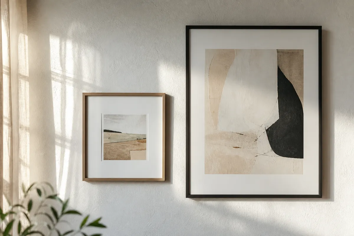
A gallery wall can make a room feel collected and personal—or like a thrift pile hit the drywall. The difference is rarely the art budget. It is layout discipline: spacing, alignment systems, scale mix, and a clear “anchor” so the eye has somewhere to land. Whether you are styling a living room sofa wall, a stair run, or a narrow hallway, good gallery wall layout ideas start with measurement and a paper template, not with hammer-first optimism.
This guide walks through practical layout systems that interior editors use repeatedly, how to plan around furniture and lighting, common mistakes that cheapen the result, and when a single large piece is smarter than a cluster. No fake designer credentials, no invented trends—just layout methods you can execute with painter’s tape and a level.
Why layout matters more than buying more frames
Frames, mats, and prints get the attention, but spacing is what reads as “designed.” A wall with modest prints and consistent gaps often looks more expensive than a wall of mismatched high-cost pieces with chaotic edges. Layout controls:
- Visual weight left-to-right and top-to-bottom
- Relationship to sofa, console, bed, or stair angle
- Whether the collection feels like one composition or many competing objects
- How lighting hits glass and mat boards
If your last attempt felt busy, you probably do not need more art. You need a system.
Plan before you put holes in the wall
Measure the furniture relationship first
For a sofa wall, the gallery should usually relate to the sofa width, not the entire wall width. A common editorial approach is to keep the art composition roughly 2/3 to 3/4 the sofa length, centered on the seating, with breathing room at the ends. Leave space above the sofa back so heads do not collide with frames—think clearance, not jammed tightness.
For consoles and beds, center on the furniture mass, not on the architectural midpoint if those two disagree. Rooms look calmer when art follows the furniture you actually use.
Use paper templates
Trace each frame on kraft paper, cut templates, and tape them up. Live with the paper for a day if you can. This is the cheapest way to test:
- Grid vs salon-style clusters
- Horizontal rail alignment vs centered clusters
- Whether the bottom edge clears lamps and décor objects
Decide your alignment rule
Pick one primary rule before mixing exceptions:
1. Strict grid — equal rows/columns, equal gaps
2. Common midline — centers align on a horizontal or vertical axis
3. Edge rail — tops or bottoms share a line
4. Salon cluster — varied sizes with tight, consistent outer envelope
Mixing all four at once is how layouts fall apart.
Layout system 1: the clean grid
Best for modern rooms, offices, and matching print sets.
- Use identical frame sizes or a repeating two-size pattern
- Keep gaps consistent (often in the 2–3 inch range for smaller frames; slightly more for large)
- Align with a laser level or a chalk line lightly marked
- Start from the center outward so edge errors do not cascade
Tradeoff: grids look intentional but can feel cold if every print is similar. Vary subject matter or mat width inside identical frames to keep life in the set.
Layout system 2: the anchored salon wall
Best for eclectic homes and collected art over years.
- Choose one larger anchor piece slightly off-center or centered depending on furniture
- Build outward with medium and small frames
- Keep outer silhouette roughly rectangular even if interiors vary
- Maintain similar gap rhythm (visual consistency matters more than perfect math)
Tradeoff: salon walls hide imperfect matching, but without an outer envelope they sprawl. Tape the outer boundary first.
Layout system 3: horizontal “rail” for long sofas
- Establish a strong horizontal centerline at a comfortable viewing height
- Align frame centers on that line, or align bottoms for a calmer modern look
- Use odd numbers of frames for classic balance when sizes match
- Leave negative space at ends so the sofa arms still “breathe”
This layout photographs well and is forgiving for renters who want fewer stacked rows.
Layout system 4: vertical stack for narrow walls
Hallways, powder rooms, and wall slices beside windows love vertical compositions.
- Two or three frames stacked with identical gaps
- Or one tall piece with two smaller companions
- Watch door swing and switch plates before committing
- Keep bottom frame high enough for traffic and bags in hallways
Layout system 5: stair-step progression
On stair walls, the art should roughly follow the angle of the stairs without becoming a literal diagonal sticker pack.
- Map the handrail angle lightly
- Step frame centers upward in consistent intervals
- Prefer similar frame finishes so motion reads as rhythm, not clutter
- Mind head clearance on the walk line
If the stair wall is short or broken by windows, a single vertical piece or two large works may beat ten tiny frames.
Spacing, height, and scale rules that prevent chaos
Gaps
Consistent gaps read as intentional. Wildly varying gaps read as unfinished. If frames differ a lot in size, keep the gap steadier than the frame style.
Height
Gallery centerlines often sit near standard art height, then adjust for sofa backs, mantel mass, and ceiling height. In rooms with very high ceilings, do not automatically march art up into empty sky—connect it to human-scale furniture first, then consider a second higher zone if needed.
Scale mix
A useful mix is one dominant piece, a few medium supports, and small accents—not fifteen mediums all shouting. If everything is medium, the wall lacks hierarchy.
Frames and finishes
You can mix metals and woods, but give the mix a rule: warm metals only, black frames only, or oak + black as a closed set. Unlimited finish mixing is a common reason “expensive art” still looks unsettled.
Working with color, mats, and subjects
- Repeat 2–3 colors across the set so the wall coheres
- Mats create breathing room; oversized mats can elevate inexpensive prints
- Alternate busy and calm pieces so the eye can rest
- Personal photos work best when edited to a shared tonal family (all warm black-and-white, all soft color, etc.)
If your room palette is quiet, let art carry contrast. If the room is already patterned, choose calmer art layouts (grid, fewer pieces).
Lighting that makes layout succeed
A great layout fails under bad light. Prefer:
- Wall washers or picture lights that do not blast glare on glass
- Avoid single harsh overheads that cast frame shadows like steps
- Consider non-glare glazing for opposite-window walls
- Test at night with your real lamps—daylight layouts can die after dark
Do not place highly reflective glass art directly opposite intense unshielded bulbs without checking reflections.
Mistakes to avoid
- Starting with nails instead of templates
- Centering on the wall when furniture is off-center
- Climbing too high toward the ceiling and abandoning the sofa relationship
- Mixing five frame colors with no repeating rule
- Tiny frames lost on a huge wall (scale mismatch)
- Ignoring outlets, vents, and thermostats until after layout
- Overfilling edge-to-edge so the composition cannot “float”
- Failing to check weight ratings and wall type before hanging glass
- Drilling without considering hidden wiring or plumbing paths
Quick-reference checklist
| Step | Do this |
|---|---|
| 1 | Measure furniture width and ceiling height |
| 2 | Choose one layout system (grid, salon, rail, stack, stair) |
| 3 | Cut paper templates for every frame |
| 4 | Tape outer envelope and primary alignment line |
| 5 | Standardize gaps before style mixing |
| 6 | Check lighting and glare at night |
| 7 | Hang with proper anchors for wall type |
| 8 | Step back from room entry—adjust once, not twelve times |
When a gallery wall is the wrong answer
Choose a single large work or diptych when:
- The wall is already architecturally busy (strong paneling, mural, stone)
- The room is small and visually noisy
- You cannot commit to consistent framing
- You need calm behind a bold sofa or patterned rug
A strong single piece is not a compromise; it is often the more adult solution.
Budget and renter notes
- Identical inexpensive frames with custom-ish mats can outperform random premium frames
- Command-type solutions vary by weight—respect load ratings; heavy glass needs real anchors
- Print quality and mat proportion matter more than logo names on frames
- Build over time: leave a planned empty slot rather than forcing a weak piece to “finish” the wall today
Safety notes for hanging and hardware
Gallery walls are mostly design work, but hanging is still a physical job. Take basic precautions seriously:
- Use anchors rated for your wall type (drywall, plaster, brick, concrete). Picture hooks that only bite paper-thin drywall can fail with glass frames.
- Locate studs when hanging heavy mirrors or large multi-pane sets; do not assume adhesive strips replace structural anchors for heavy loads.
- Mind electrical and plumbing inside walls before drilling. If you hit unexpected resistance or are unsure what is behind a surface, stop and consult a qualified professional.
- Ladder and step-stool safety: keep a stable stance, avoid overreaching, and have a second person spot when working on stair walls.
- Glass handling: wear eye protection when hardware work is near glazing; set frames down on padded surfaces so glass does not chip.
- Renter systems: follow load ratings exactly. When a product says a maximum weight, treat that as a hard limit, not a suggestion.
- Stop DIY if a wall crumbles, a mirror is too heavy for available hardware, or wiring must be moved to clear a layout.
A beautiful layout is not worth a failed anchor or an electrical surprise. When in doubt on structure or wiring, hire help for the install and keep the creative layout work for yourself.
FAQ
How many pieces should a gallery wall include?
Enough to form one clear composition—often 5–12 for residential sofa walls—but number matters less than envelope and hierarchy. Five well-scaled pieces can beat fifteen tiny ones.
Should all frames match?
Not mandatory. Matching frames is the easiest path to cohesion. If you mix, limit finishes and repeat each finish at least twice.
How far above the sofa should art sit?
High enough for comfort and clearance, low enough to relate to the sofa back. Use templates and sit on the sofa to test. If guests will lean back, avoid precarious overhangs.
Can I mix photos, prints, and objects?
Yes if you keep depth modest and secure objects safely. Deep shadow boxes change spacing and shadow behavior—plan them as anchors, not afterthoughts.
What if my wall has a light switch in the way?
Incorporate the switch into negative space or shift the composition. Do not hide switches behind frames.